Source: lookintobitcoin.com
Zoom in with touchscreen: Touch and hold with ONE finger then drag.
Zoom in on desktop: Left click and drag.
Reset: Double click.
By comparing the 28 day change in price (%) with the 28 day change in active addresses (%) for Bitcoin we are able to create a short-term sentiment indicator called AASI (Active Address Sentiment Indicator).
Grey lines on the chart show the change in active addresses.
On the outer boundaries of those grey lines are standard deviation bands.
Dotted red line = upper boundary
Dotted green line = lower boundary
Orange line is the 28 day price change (%).
When the orange line reaches the upper boundary (red dotted line) it is indicating that short term market sentiment is overheated. Because the rate of increase in price is outstripping the rate of increase in active addresses.
Zooming in on the chart (left click and drag) we can see that this often corresponds with $BTC price (blue line) stalling and/or retracing.
The opposite is true when the 28 day price change hits the lower boundary (green dotted line). Here market sentiment is overly bearish and we often see $BTC price then increasing thereafter.
In extreme market conditions the 28 day price change (orange line) aggressively breaks out beyond the dotted red and green bands. This is typically in a major market crash or in the latter stages of a bull market. I may add additional standard deviation bands to catch these moves but for now have left them off to keep the chart clean.
Pre 2015 data is quite volatile and messy so this charts starts at 01 January 2015.
Unlike many of the other Bitcoin live charts, this live chart examines lower time frames and attempts to provide a Bitcoin price prediction in terms of directional moves on weekly timeframes. So it tries to do a Bitcoin price forecast by highlighting where price may pullback or where it may bounce using price and active address data.
Another live chart that is more focused on lower timeframe moves is the Advanced NVT Signal chart.

On Chain Indicator using Realized HODL Ratio’s to identify cycle high price tops.
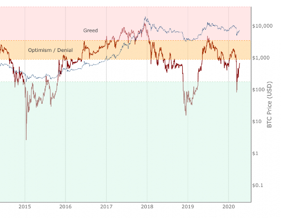
On-chain indicator for investor sentiment market stages

View of the percentage of coins HODL'd on the blockchain for over 1 year.
Any information on this site is not to be considered as financial advice. Please review the Disclaimer section for more information.